Showing posts with label comics. Show all posts

Sunday, February 16, 2014

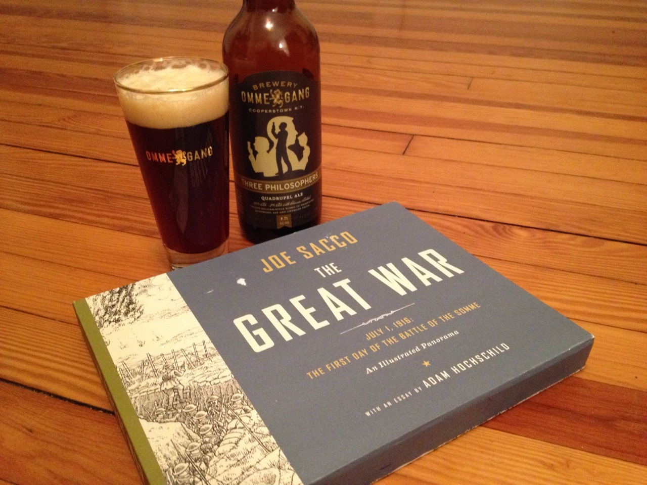
Review: The Great War, by Joe Sacco, with an essay by Adam Hochschild


With The Great War - July 1, 1916: The First Day of the Battle of the Somme, An Illustrated Panorama, comics journalist Joe Sacco has created a single, 24-foot-long gatefold image which re-creates the events of this day of battle across time and space. Surrounded by two hard covers, the gatefold image comes in a slipcase which also includes a booklet with an author's note and annotations by Sacco, as well as an essay ("July 1, 1916") by historian Adam Hochschild.


Technically, Sacco's image is a tour de force, utilizing shifting perspectives to create the illusion of a single image while also presenting a chronological narrative of the battle's stages. The amount of detail Sacco includes is staggering, including scores--no, hundreds!--of soldiers, and mazes of trenches that seem to go on for miles. Explosions, debris, and devastation abound, and the passage of time allows us to contrast the idyllic pre-battle landscape to the horrific aftermath.

I was intellectually impressed by Sacco's artistic achievement, but it is only Hochschild's essay that really devastates on an emotional level. I already knew that the First World War, that horribly mis-named "War to End All Wars," was a ridiculous waste of human life,;but Hochschild's essay covering the myriad details of this particular battle--the blindly hubristic plans, the utterly devastating results--really drives the point home in ways that not even Sacco's massively detailed panorama can achieve.

The artwork is stunning technically, but without Sacco's annotations and Hochschild's essay, I'm not sure how affecting the end result would be. Actually, I do, and the answer is that it would appeal a lot to my eyes and brain, but much less so to my heart. Sacco's image needed to be a part of this complete package; the panorama alone, impressive as it is, is not enough to drive home the point Sacco strives for. Which he himself acknowledges in his introduction:
Making this illustration wordless made it impossible for me to provide context or add explanations. I had no means of indicting the high command or lauding the sacrifice of the soldiers. It was a relief not to do these things. All I could do was show what happened between the general and the grave, and hope that even after a hundred years the bad taste has not been washed from our mouths. ("On the Great War," Author's Note, p. 2)
Design-wise, The Great War is an impressive package, even if the panorama itself is an unwieldy read (but how could it not be, unless it were mounted along a wall?). One bravura touch it how the book begins and ends. The first image on what would normally be the front endpaper is a close-up drawing by Sacco of the famous Lord Kitchener WWI recruitment poster, followed by the title page; the rest of the book is the panorama itself, which extends all the way to what would normally be the back endpaper. In that final portion of the image, we see soldiers digging and filling graves. So the design leads us rhetorically from heavily romanticized recruitment to the devastating, utter finality of death. The end.

Make war no more!
Tuesday, December 10, 2013

Service Interruption: Use Alternate Route

It's been a few months since I've posted a review here, but that doesn't mean I haven't been reading and reviewing books! It's just that I've been podcasting instead of typing. Many weeks ago I was invited by Derek Royal to sit in for "an episode or two" of The Comics Alternative ("Two guys with PhDs talking about comics!") while his regular co-host Andy Kunka was unavailable. Well, "one or two" episodes soon multiplied, and now, even though Andy is now back in the fold, the Two Guys have invited me to be a permanent addition to the show.

So, to keep up with my verbal comics reviews, along with the interviews that I help conduct with artists and writers, you can follow the Comics Alternative updates I post at my other blog, Comics Research and Such. Or, just subscribe to the Comics Alternative podcast!

And I haven't forgotten about this blog. I have a few non-comics books waiting to be reviewed right now, and I plan to get those up here sooner rather than later.

Happy reading!

Thursday, September 12, 2013

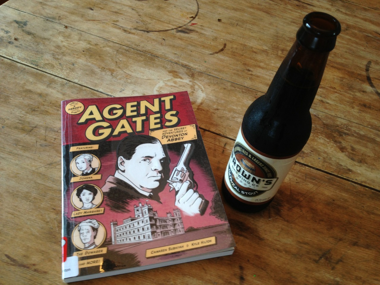
Review: Agent Gates and the Secret Adventures of Devonton Abbey (a parody), by Camaren Subhiyah and Kyle Hilton

It's an intriguing idea for a mash-up: Take the severely reserved characters of the incredibly popular Downton Abbey ITV (and PBS) television series, and re-imagine their story (already tinged with political overtones), changing many of those characters to secret agents. Seems like a can't-miss premise for wacky genre fun, right? And it almost is.

While it's primarily the working-class characters who get to be secret agents, the upper-class characters are almost invariably portrayed as superficial simpletons (Richard Crawhill, Earl of Granville, being the most ridiculous of the ridiculous here). This characterization helps sell the class-conscious narrative, of course, although the parody does descend to some very silly depths. For instance, the inheritance question lying at the center of Downton Abbey here gets an additional wrinkle: if the Crawhills' pregnant dog Sweetsie has a male pup, he will inherit Devonton, and then Lady Margaret won't need to marry Cousin Martin after all. And so on.

Artist Kyle Hilton's character likenesses are usually spot-on, so much so that, except in rare instances, it really does look like you're "watching" a lost episode of the series. Alas, writer Camaren Subhiyah's script isn't content simply to mash-up two genres; instead, it adds strong science-fiction and fantasy aspects to the plot as well, involving elaborate pseudo-scientific gadgetry, the Philosopher's Stone, special mental and physical powers, and more. Oh, and Gates & Co. manage to avert the onset of World War I in the bargain.

It all just seems a bit too over-the-top. The SF aspects threaten to divert the plot too far from parody into, dare I say it, originality. I guess I was looking for something a bit more comfortable in this parody. Agent Gates and the Secret Adventures of Devonton Abbey might have been better served by disguising its Downton-debt and simply telling its original story on its own merits. Although I wonder if it would have been published at all in that case...

Agent Gates and the Secret Adventures of Devonton Abbey (A Parody)
by Camaren Subhiyah and Kyle Hilton
Andrews McMeel 2013
ISBN-10: 1449434347
ISBN-13: 978-1449434342
128 pages, $14.99

Sunday, August 25, 2013

Review: FF vol. 2: The Supremor Seed, by Hickman, Tocchini, Epting, Kitson et al.

Collecting issues #6-11 of the first run of the title FF (which temporarily replaced Fantastic Four), this book continues a cosmic epic begun in who knows which other comics, Fantastic Four or otherwise. Briefly: The Future Foundation (the remnants of the Fantastic Four after the Human Torch has died, plus Spider-Man, plus Dragon-Man, plus Reed Richards' father, plus Reed and Sue's children, plus assorted other younger characters) team up with a bevy of their greatest villains (including Doctor Doom and several others) to stop renegade Reeds from different dimensions from taking over all of everything. At the same time, the Inhumans return from exile. And various mayhems ensue.

Growing up in the 1970s, I always loved the Fantastic Four - I benefited from being able to read the current issues of the title as well as much of the original Stan Lee/Jack Kirby run thanks to the Marvel's Greatest Comics reprint title - and consequently I like to peek in every once in a while to see what's being done with the characters. FF vol. 2 has some interesting moments of characterization, but the plot intricacies rely too heavily on deep continuity knowledge which I don't possess, and which the book itself fails to provide; the Inhumans' storyline in particular is nearly impenetrable, even with an entire issue featuring just them, without a single appearance of the title team. Also, the switch in art styles more than midway through is jarring.

It's a shame, because I did like the book in places. But too much remains unsaid, relying either on previous plot knowledge or too heavily on the art to convey narrative nuances that simply aren't there without accompanying text. The story was, I'm sure, more rewarding to those weekly comics-shop readers who followed several titles as they were published, and who were therefore able to see connections only hinted at in these pages. FF vol 2 is a prime example of a "stand-alone" graphic novel that doesn't.

FF vol. 2: The Supremor Seed
By  Jonathan Hickman, Greg Tocchini, Steve Epting, Barry Kitson et al.
Marvel Comics, 2011
ISBN-10: 0785157697
ISBN-13: 978-0785157694
144 pages, $24.99

Monday, July 1, 2013

Review: Black Paths, by David B.

David B. is one of my favorite cartoonists: His lush drawings brim over with bold design work, mythological references, and symbolic energy. Epileptic, his account of growing up with a brother who suffered from grand mal seizures and his family's attempts to cope with the situation, remains one of the finest non-fiction graphic novels I've ever read. My French is very poor, but back when I had access to French-language comics I would buy anything with his name on it, just to luxuriate in his imagery, even when my understanding of his verbal nuances was lacking.

Black Paths is a fictionalized account of the Free State of Fiume after the First World War, told mostly through the eyes of Lauriano, a young writer who suffers from his experiences in WWI, and Mina, a French cabaret singer. The book is utterly beautiful: B.'s artwork sings with the addition of color (most of his earlier work I'd encountered was in black and white only), and--as usual for him but unusually for most cartoonists--there are many passages where impressionistic images and non-standard design and layout create beautifully dream-like moments.

However, the ins and outs of political intrigue have never held much appeal to me, and such matters are the meat of this book. Perhaps I simply wasn't in the right mood when I read it, but I could never seem to connect with the narrative in a meaningful way. I am convinced that the fault lies with me, not with the cartoonist, though. One day I'll give this book another chance, which it deserves. It's a bravura exercise in cartooning, but on a subject matter I couldn't seem to relate to. This time.

Black Paths
by David B.
Self Made Hero, 2011
ISBN-10: 190683833X
ISBN-13: 978-1906838331
128 pages, $24.95

Tuesday, June 25, 2013

Review: Spider-Men, by Brian Michael Bendis and Sara Pichelli et al.

The reason this book exists is the very reason that so many people find it hard to "get" superhero comics. Briefly? There's another "Marvel Universe"* outside the regular one with all the heroes you probably know (from the movies if nowhere else**). This "Ultimate universe" has the same heroes, mostly, although with sometimes subtle, other times profound differences. Perhaps the biggest difference is that "Ultimate" Spider-Man--a youthful Peter Parker--died. In the Ultimate universe, at least so far, dead means dead (unlike the regular Marvel Universe, where people die and come back to life over and over, like clockwork). But before too long, Miles Morales, a thirteen-year-old mixed-race youth, gained spider-powers and assumed the mantle of Spider-Man. These two universes existed side-by-side on the comics store shelves for a dozen years, but until Spider-Men, there had never been a cross-over story bringing them together.

If you're confused, you probably don't read superhero comics all that regularly. And therefore, Spider-Men might not be the book for you to start with. Writer Brian Michael Bendis (who's scribed Ultimate Spider-Man from day one) does his best to set the stage(s) for this event: we get a very clear idea of who Peter Parker is, and a somewhat less-clear but still revealing portrait of Miles Morales. The first chapter opens with a several-page monologue by Peter/Spider-Man about why he loves New York City; once Peter gets transported to the Ultimate universe and Miles shows up, we see how the young hero is slowly fitting into the super-fabric of his own version of the city.

But the heart of the book--and I do mean heart--lies in the meeting, mid-point in the narrative, between "our" Peter Parker and the Ultimate versions of Peter's Aunt May May and Gwen Stacy (who, in our universe, was Peter's girlfriend until she was killed at the hands of the Green Goblin, in one of the most momentous story lines in the character's history--a death which haunts him only second to that of his Uncle Ben). Clearly, beyond the hook of the first cross-over between these universes, what writer Bendis is most interested in is these characters.

At first, May and Gwen--like everyone else--chides this adult Spider-Man for dressing up in the dead Parker's costume (his identity having been revealed to the world at his death). Once Peter unmasks and, predictably, May faints at the knowledge that her beloved nephew (at least a version of him) is alive and in her life again, the three characters have a lengthy conversation, which moves from tentative outreach and regret to gradual acceptance and, eventually, a kind of joy.

It's pure soap opera. But then, that's really what superhero comics are, when they work well. The costumes and powers and fights are part of the genre, of course, but the serial nature of superhero comic book storytelling has relied on the emotional histrionics of soap opera since at least the birth of the so-called Marvel Age of Comics in the 1960s. Writer Stan Lee and artist Jack Kirby's Fantastic Four began the trend, but Lee and artist Steve Ditko's Amazing Spider-Man arguably perfected the formula. Bendis and Ultimate Spider-Man artist Sara Pichelli show a lot of comfort working in larger-than-life, character-based psychodrama here.

Pichelli's artwork is lean and clean and very much what good super-hero comic art looks like now, with detailed environments and some very nicely exaggerated spider-poses on our eponymous heroes. But if anything, her depiction of facial expressions is a bit restrained--which would be fine in a literary slice-of-life comic, but super-soap gives you a license to kick up the histrionics. Still, that's a small quibble. I prefer my cartooning a bit more expressive and abstracted (see: Ditko and Kirby again), but as contemporary superhero art goes, this is fine stuff. Layouts are varied but always readable, moving the story forward without much in the way of flashy distractions.

I haven't talked much about the plot or the villain here. But really, beyond the fact that Spider-Man goes to the Ultimate Universe*** and meets not only his replacement but also several other heroes, the plot's incidental to the character interactions. If you haven't read many superhero comics--particularly Spider-Man comics--the character stakes might not mean all that much to you. (Again, serial storytelling means that you get to know these characters in depth; a small verbal aside here can feel freighted with import if you've followed the characters beforehand.) But for regular Spider-Man readers, Spider-Men provides a dose of emotion and a bit of wonder. And Peter's mysterious discovery at the very end ensures that there will be more where this story came from, in some other fashion.

*Actually, there are an infinite number of them, but I'm trying to keep this simple...

**Although the Marvel movies often conflate the "original" and "ultimate" versions of these heroes...

***Where everyone talks in a mixed-case typeface, unlike the all-caps "regular" universe. No, there's no particular reason I placed this footnote in this sentence; I just wanted to shoehorn in a font-nerd reference somewhere...


Spider-Men
by Brian Michael Bendis and Sara Pichelli et al.
Marvel, 2012
ISBN-10: 0785165339
ISBN-13: 978-0785165330
128 pages, $24.99

Wednesday, June 19, 2013

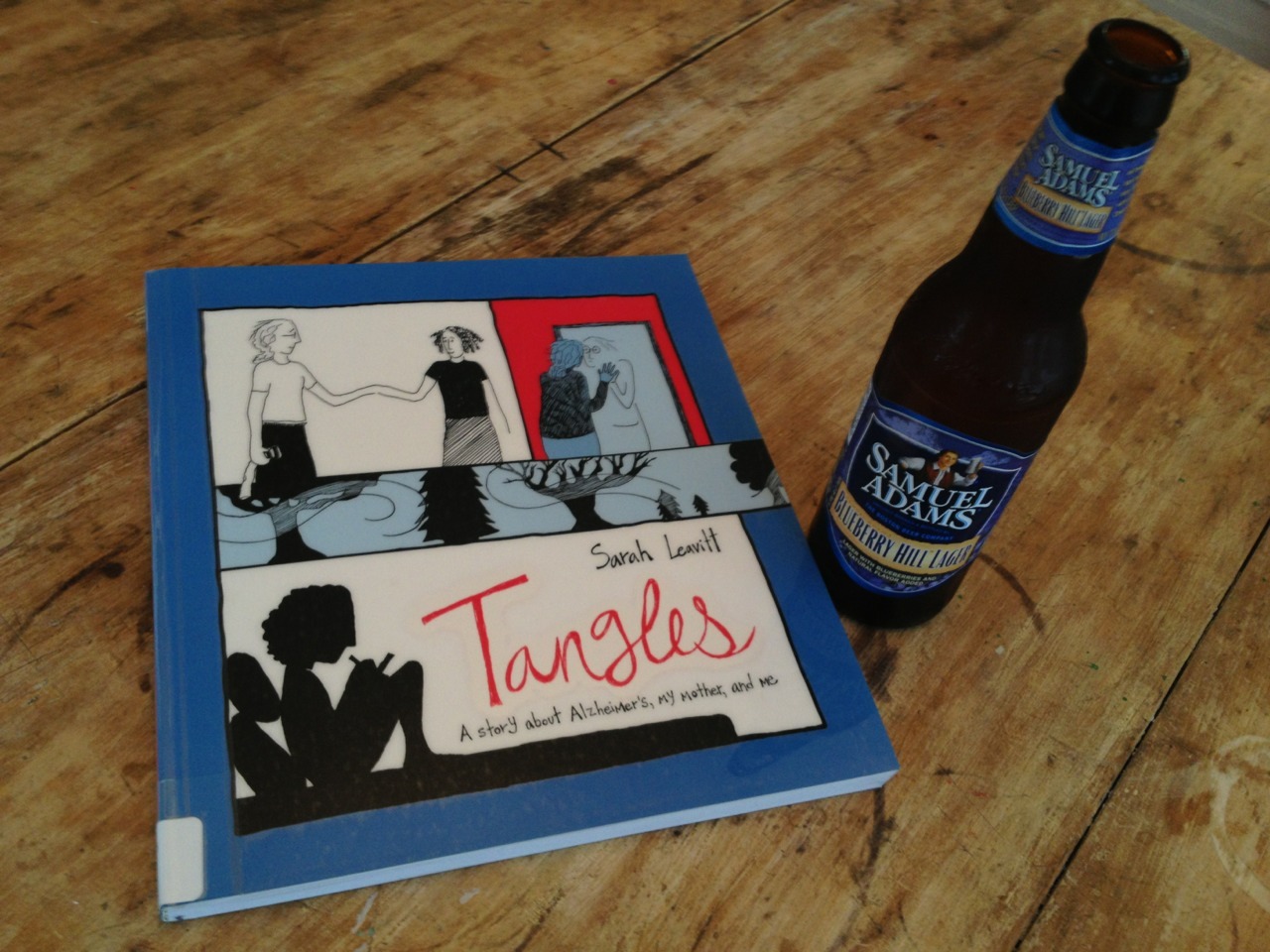
Review: Tangles, by Sarah Leavitt

This is a very brave book. In Tangles, Sarah Leavitt recounts how her family lived with, dealt with, and was changed by her mother Midge's early-onset Alzheimer's (she began showing symptoms at only 52 years of age). We see an entire family coming to terms with this terrible illness, all in different ways, yet always out of love. It's not a guidebook for how to deal with Alzheimer's (how could it be?), but it is a record of what can be done, what might be done, and (only a couple of times) what perhaps shouldn't be done.

Tangles is simply awash in tiny details, thanks to Leavitt's coping mechanism of recording, in words and pictures, hundreds (thousands?) of observations of--and quotations from--her rapidly changing mother. The book's first-person narration of these tiny details seems to beg the question, Was this person who talked to broccoli still the mother who raised my sisters and I, the woman so engaged in education, the wife so loving and loved? The answer seems to be "Yes and no," of course. There's still a core of the Midge that we're introduced to in the book's preliminary, historical sections, but there's also a new person, one who sings to herself (no longer with her sisters) while being bathed or who writes ungrammatical notes to her daughter.

As a cartoonist, Leavitt draws in an unadorned, highly simple--even simplistic--style. I at first thought the style too simple but eventually recognized it as direct and honest. The book is a chronicle of Leavitt's feelings and impressions as much as it is a record of specific events, and I think a more highly rendered style would only serve to fetishize the events and overpower her impressions.

The book's large, square pages are generally constructed of five tiers of gutterless panels, leading to a dense reading experience; a lot happens on each page, and Sarah, our narrator, is often at a loss in trying to make sense of it all. How can you make sense of that which so often, by definition, is nonsensical? Such as the note from Midge to Leavitt's partner Donimo, which Leavitt reproduces, isolated in the corner of an otherwise blank page: "Love to Donimo / Hope you like Bmdows. / See you soon / family is / The whole / eags to see you / from Midge" (page 69).

The book is peppered with such large, nearly empty pages, falling in between some of the short, dense chapters. They often highlight quotations from Midge, or simple, striking moments: Actions divorced from time and context, much like Midge's perception of the world around her. Because it is so honest, Tangles is sometimes not an easy book to read. But it is a powerful one.


Tangles: A Story about Alzheimer's, My Mother, and Me
by Sarah Leavitt
Skyhorse Publishing, 2012
ISBN-10: 1616086394
ISBN-13: 978-1616086398
128 pages, $14.95


Monday, June 3, 2013

Review: Daredevil by Mark Waid vols 1 & 2, by Waid, Rivera, Martin, Rios, Kano, Pham et al.

I haven't read a new Daredevil comic book in many years, but I've heard enough about them to know that the character had been put through the wringer time and again, and that the title was known for being psychologically dark. Daredevil's secret identity as blind lawyer Matt Murdock had been made public (more than once?); he had become crime lord of New York (I think); he had been replaced by The Black Panther. In other words, typical high-impact superhero soap opera, though even grittier and more morally ambiguous than most.

But when Marvel Comics re-launched the title (yet again!) in 2011, it was announced that the character was headed in a new direction--or, should I say "old," for this new series, under writer Mark Waid, would be a return to the character's "lighthearted acrobat" roots, albeit one that would somehow not wipe away the character's more recent dark developments. Intrigued, I picked up the first two collected volumes from the library. What I found was a solid superhero comic, often visually innovative, which did indeed rekindle the sense of adventure and fun I recall from my own childhood reading of the character.

The gist of writer Waid's approach is that Murdock has survived being put through hell, and his coping mechanism is to treat life as a laugh (mostly--he is still a lawyer and crime-fighter, after all). While his secret identity was made public, the public's reaction to news is fickle, so while some people still believe that Murdock is Daredevil, others are unsure. Matt sometimes wears an "I'm Not Daredevil" shirt to deflect suspicion (though why that wouldn't just reconfirm said suspicion isn't exactly clear). His reputation makes it difficult for any clients he or his partner Foggy Nelson represent to get a fair trial, so he comes up with a new tactic: Their law firm will take on clients whom no one will represent and then coach them how to act as their own counsel, thereby allowing them to go to court without the distraction of all the "Daredevil" innuendos that follow Murdock wherever he goes. It's a narrative conceit that is as clever as it is utterly ridiculous; thankfully there's enough super-action that we don't see too, too many of these cases.

The artwork is in keeping with this lighter narrative approach. Particularly in the case of artist Paolo Rivera, we get characters composed of clean lines (if often a bit stiff in the staging) and innovative, almost bouncy page layouts. There are some new tricks to represent Daredevil's "radar sense" (often red contour lines over black backgrounds, as well as tiny inset panels which draw our attention to small details, highlighting Murdock's own heightened view of the world) as well. Even Rivera's cover to the first collection (which was also the cover to the first new issue) plays with how Daredevil exists in a world without vision: everything in the background environment is composed of words, representing how his brain "molds" objects out of sound. Examples: birds are built out of the words "flap flap flap," a water tower out of "glug gurgle drip drop," exhaust out of "hsssss." And Daredevil holds one of his billy clubs directly in front of his eyes, emphasizing for the reader the character's sightlessness.

The stories also work thematically with the character's attributes, pitting him against adversaries like Klaw (a being composed of solidified sound) and the nearly blind Mole Man--both, I think, for the first time. He also teams up with Spider-Man (a character with whom he has a long history) and hooks up with The Black Cat (a morally grey acrobat herself). And the macguffin of the OmegaDrive (a quantum hard drive containing information on several crime families and syndicates) ensures that Daredevil is never far from a tussle with any one of Marvel's many mafia surrogates.

All in all, these are solid, well-crafted superhero stories, light-hearted (usually) but not light-weight.

Daredevil by Mark Waid vol. 1
by Mark Waid, Paolo Rivera, Marcos Martin et al.
Marvel, 2012
ISBN-10: 0785152385
ISBN-13: 978-0785152385
152 pages, $15.99

Daredevil by Mark Waid vol. 2
by Mark Waid, Paolo Rivera, Emma Rios, Kano, Khoi Pham et al.
Marvel, 2012
ISBN-10: 0785152407
ISBN-13: 978-0785152408
136 pages, $15.99

Monday, May 27, 2013

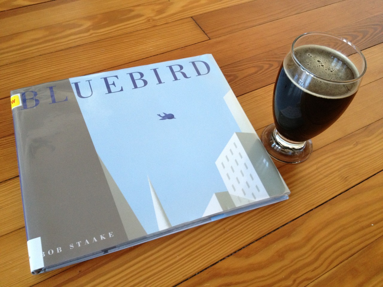
Review: Bluebird, by Bob Staake

Bluebird, the new wordless picturebook by Bob Staake, is, quite simply, gorgeous. It tells the relatively simple story of a lonely New York City boy who meets and has his life changed by a bluebird. It's a tale of sadness, friendship, loss, and renewal, presented in comics-style, multi-panel pages colored primarily in blues, greys, and white.

Staake's geometric style ("rendered," as the indicia informs us, "in Adobe Photoshop") seems at first glance as if it might be cold; but, as anyone familiar with his other books or his illustration work for The New Yorker and elsewhere already knows, his spheres and boxes and cones are capable of conveying and creating deeply emotional scenes, from the little boy's downcast eyes and defeated posture in the book's beginning; to the wonder of the city's architecture, both grand and mundane; to the threatening moments in the woods of the park; to the freedom and exhilaration of the skies. Rarely have such simple shapes seemed so full of life.

Wordless (or "silent") books of course rarely have no words at all; while these pages don't offer narration or dialogue, we can still see words on signs or on classroom blackboards. And Staake's backgrounds are always worth exploring. Young eyes will have a lot to take in once they've devoured the main plot. I particularly liked the poster on the classroom wall which hearkens back to Staake's dedication in the front of the book.

The publication design here is elegant. Picturebooks often provide immersive book experiences like this for their young readers, and Bluebird is no different: The story actually begins on the front cover, where we meet the bluebird and then follow its flight across the city over the course of the front endpapers and then the indicia and title pages.

At turns melancholic and joyous, but always lyrical, Bob Staake's Bluebird belongs on the bookshelf of every child who's ever felt alone in or confused by the world around them--which is to say, of course, all children, current and former.

Bluebird
by Bob Staake
Schwartz & Wade, 2013
ISBN-10: 0375870377
ISBN-13: 978-0375870378
40 pages, $17.99

Wednesday, May 8, 2013

Review: Henry & Glenn Forever, by Igloo Tornado

What is Henry & Glenn Forever? If, like me, you've been living under a rock since 2010, you might need an introduction. The one from the book itself ought to do:

Henry [Rollins] and Glenn [Danzig] are very good "friends."
They are also "room mates."
Daryl [Hall] and John [Oates] live next door.
They are satanists.

That's all you need to know.

Sounds like the set-up for an in-your-face, sure-to-offend exercise in excess, right? Well, think again, because the best adjective I can come up with for H+G=4EVA (apart from "hilarious") is "charming." In casting these hard rock/metal icons as gay lovers, the cartoonists of Igloo Tornado (a collective consisting of Tom Neely, Gin Stevens, Scot Nobles, and Levon Jihania) chose--wisely--to focus not on stereotypical "gay" tropes but, instead, to focus on the idea of "lovers." Thus, for example, we get several pages from Glenn's diary filled with his feelings of insecurity about his relationship with Henry:
i yelled at Henry the other day because he never does the dishes and i always end up being the one who cleans up after him. i wanna help him because he's so busy getting ready for his tour, but i'm so overwhelmed...
It's not all sadness and regret, however. The book is comprised of one-page comics and drawings, from diary entries and postcards, to single-panel gag cartoons, to repetitive headshots of the couple, with Henry saying something enigmatic and Glenn always--always--agreeing with him. My favorite comic, perhaps, consists of a conversation about painting the bathroom black: Glenn is brushing his teeth, and Henry's taking a bubble bath. Sheer domesticity. There are also running gags about Glenn's fixation with werewolves, and about the couple's missing dog that Seussian satanists Daryl & John may or may not know something about.

Silly, simple and a bit surreal, but never really exploitative, Henry & Glenn Forever nevertheless manages to convey more genuine emotion than many other "serious" graphic novels I've read. But it also includes a scene with all four main characters jamming to "Kiss On My List." Sublime, meet ridiculous.

Henry & Glenn Forever
by Igloo Tornado
Cantankerous Titles, 2010
ISBN-10: 1934620939
ISBN-13: 978-1934620939
64 pages, $6.00

Thursday, March 28, 2013

Review: The Hypo - The Melancholic Young Lincoln, by Noah Van Sciver

We're so used to seeing Lincoln portrayed as a magisterial president, that we (or at least I) have trouble thinking about him as a person in development, as a youth struggling, as all youth must, to discover who he is. In The Hypo: The Melancholic Young Lincoln, Noah Van Sciver gives us a fine portrait of that Lincoln-in-process by focusing on his private, internal struggles. "The Hypo" (Lincoln's term for his sometimes crippling depression) debilitates him, causing doubt and fear to sometimes rule his life. It's a portrait that any sufferer of depression will recognize.

Van Sciver's drawing is assured and highly detailed (backgrounds and environments are often rendered quite specifically, really grounding the story in its time and place), while remaining a bit "cartoony" - his is an engaging, highly readable style. My one complaint, visually, is that early on, Lincoln and his randy roommate, Joshua Speed, look so much alike that sometimes in conversation I became confused as to who was who.

Narratively, you can't help but empathize with young Lincoln in his struggles - his love life is a shambles, for example, although the book's happy ending reveals that he eventually (if perhaps only temporarily) overcame some of "The Hypo."

I understand the desire to focus on the details of Lincoln's personal life over those of his his professional career, but unfortunately this strategy at times makes for some confusing moments. References that other characters make in passing to Lincoln's growing political influence seem to come out of nowhere. I mean, of course we all know that Abraham Lincoln had a political career, but the Lincoln of The Hypo doesn't quite seem capable of sustaining one. We get a few small glimpses, but they're nowhere nearly as finely developed as are the more intimate moments in the young man's life. I would have appreciated a bit of a broader focus on Lincoln's life and work over the course of The Hypo - I can only imagine that in Van Sciver's hands, Lincoln's professional struggles would become as fascinating as his personal ones surely are here.

The Hypo: The Melancholic Young Lincoln
by Noah Van Sciver
Fantagraphics, 2012
ISBN-10: 1606996193
ISBN-13: 978-1606996195
192 pages, $24.99

Monday, March 11, 2013

Review: A Wrinkle in Time: The Graphic Novel by Hope Larson and Madeleine L'Engle

My fifth grade teacher, Miss Wocher, read Madeline L'Engle's classic science-fiction children's novel A Wrinkle in Time to our class, one chapter each Friday afternoon. After a few weeks, I bought my own copy so that I could read along with her. It quickly became one of my favorite books; I was enchanted with its fantastic premise (a group of children travel through time and space, guided by three mysterious women, to rescue their father), its quirky characters, and L'Engle's overall way with words. (Although I was devastated when I looked up tesseract in my dictionary only to conclude that, apparently, she had made it up!) I never forgot the book, and, when I taught Children's Literature courses many years later, AWiT was always on my syllabus.

So I approached Hope Larson's adaptation, A Wrinkle in Time: The Graphic Novel, with no little trepidation, even though I had liked earlier work of Larson's that I had seen. Could this adaptation possibly compare to my experience with the original? (Even though, as I've written about before, hoping for absolute fidelity to an original work in an adaptation is a sucker's game.) However, my fears were for naught. Larson actually achieves a remarkable amount of fidelity to L'Engle's original novel, and the publisher (Farrar, Straus and Giroux) is to be commended for allowing Larson to produce a truly substantial adaptation: At just shy of 400 pages long(!), this book has the room few other adaptations are afforded to really slow down the storytelling and include the smaller, character-enhancing moments that almost always get sacrificed in adaptations for the sake of "just getting the plot across," usually as economically (i.e., briefly) as possible.

We get to see lead character Meg Murray's awkwardness, her hesitancy, her headstrong nature, and her bravery in full measure, and the other characters are also allowed to develop and to shine. For example, during the first and most difficult "tesser" (a sort of space/time dimensional warp), Meg's disconcerting reaction to the process is given about seven full pages to play out, really allowing the reader to experience her disorientation almost as fully as one does in reading the novel itself. If you haven't read many comics adaptations, you cannot imagine how refreshing this luxury of space is. Even most film adaptations of literary works must cut out more detail and texture than Larson needed to here.

The artwork, in black and white with blue tones, manages to be both straightforward and carefully delineated in equal measure. Larson's inkwork is lush and bold, appealingly simple and, yes, cute, but without ever seeming too cloyingly cartoonish. Larson is equally adept at depicting subtle character emotions and otherworldly dimensional realms. Some readers might find the more alien landscapes a bit thinly detailed in places, but I think this is very much in keeping with L'Engle's original book, which excels at creating feeling and mood over intricate technical descriptions. At these books' heart is the emotional arcs of the characters - especially that of Meg, a character with whom I identified a lot as a child - and not thick science-fiction detail.

Is reading the graphic novel the same experience as reading L'Engle's original? Of course not - but then, it's not meant to be. The original novel is still there to thrill and delight young readers. But Hope Larson's A Wrinkle in Time: The Graphic Novel is a more-than-worthy companion to L'Engle's classic book. It's a very assured and appealing work in its own right, one which offers readers a new and richly imagined version of a tale which has already endured for more than fifty years.

Madeleine L'Engle's
A Wrinkle in Time: The Graphic Novel
adapted and illustrated by Hope Larson
Farrar, Straus and Giroux, 2012
ISBN-10: 0374386153
ISBN-13: 978-0374386153
392 pages, $19.99

Thursday, February 28, 2013

Review: X'ed Out and The Hive, by Charles Burns

I first learned of Charles Burns' work in the pages of the anthology RAW, and I've been seeking out his work wherever I could find it ever since. I was curious to see what would follow his magnum opus Black Hole (collected in 2008), as that book seemed to sum up the "Teen love/Horror" themes he'd been exploring for some time.

X'ed Out (2010) and The Hive (2012) are the first two parts of a new trilogy. Love and horror are still there, but they're both... even weirder than they were before. (Those of you already familiar with Burns' work will realize how much weight the word "weirder" carries in this context.) Doug, a young performance-poet ("Hi, I'm Nitwit, also known as Johnny 23") with an ailing father, falls in love with a Patti Smith-loving photographer who forces him to explore some of his family secrets. "Meanwhile" (in some way) in an alien landscape, a simplified version of Doug finds work caring for "future queens" of a hive (even procuring strange romance comic books for one of the women) while constantly being berated by his alien co-workers; his name in this world almost seems to be "Asshole," given the number of times he's called that. His one friend in this world, a homunculus-like grifter, is on his side but also seems untrustworthy. Oh, and there's body-horror everywhere.

It had been about year in between my reading of X'ed Out and The Hive; once I read The Hive, I had to go back and re-read them both in order to try and understand what's going on. I'm not sure I succeeded. Burns' storytelling here takes "non-linearity" to new heights; there are visual and verbal echoes between the two worlds on a number of levels, but two-thirds of the way through this tale, things have yet to come together. That's to be expected in a work like this, but it's still a frustrating experience to be in the middle of. Once the third volume comes out it will be easier (I hope!) to come to terms with the narrative.

Visually, the books are stunning. Burns has occasionally let his love for Hergé's Tintin shine through in his publication designs, but here their influence of informs every inch, from the European album format to the flat colors (amazing to see this much color work from Burns, after decades of mostly black-and-white work) to "alien" Doug's quiff of hair to the endpapers featuring scenes from the books. 

I always thought that black and white perfectly suited Burns' work, so I'm surprised at how much the color really adds to the storytelling here: some scenes play out in heavily-tinted monochrome; the pages of the alien romance comic books pulse with odd printing techniques; and there's a sublime juxtaposition of a green, buggish alien face scowling over a white dress shirt, with a loose necktie flailing in the breeze. What would normally be the half-title page in these books becomes an eighteen-panel page, with panels of two colors in different patterns from book one to book two. I can't help but expect that these patterns will ultimately be revealed to be meaningful once book three, Sugar Skull, is published (this year, I hope).

These books aren't for everyone, perhaps, but I can't wait for Sugar Skull - its answers and, I expect, its further mysteries. 


X'ed Out
by Charles Burns
Pantheon, 2010
ISBN-10: 0307379132
ISBN-13: 978-0307379139
56 pages, $19.95

The Hive
by Charles Burns
Pantheon, 2012
ISBN-10: 0307907880
ISBN-13: 978-0307907882
56 pages, $21.95

Thursday, February 21, 2013

Review: The Shark King, by R. Kikuo Johnson


R. Kikuo Johnson's The Shark King is another wonderful comic for younger readers from TOON Books. I'm not sure if this tale is an actual myth or just feels like one, to its credit. Set in old Hawaii, the story concerns a woman who falls in love with and marries a mysterious man, and their child Nanaue who, born with special abilities, goes on adventures and meets his destiny. The cape you can see him wearing on the cover helps conceal the boy's strange and somewhat goofy birthright.

Johnson's art style is deceptively simple in its directness - clean and clear, with a muted palette almost out of the 1950s, the drawings often inhabit relatively complex page designs. Readers encounter lots of angular or jumbled panels along with more fairly standard griddings, giving the pages a real life and kinetic energy. (I'm reminded at times of Stephen R. Bissette's page designs in comics such as Swamp Thing and Tyrant - and coming from me, this is high praise indeed.)

The Shark King is what TOON Books calls a "Level Three" book ("Chapter-book comics for advanced beginners [...] Reader needs to make connections and speculate"), and Johnson's work certainly fits this bill. Parts of the tale are told via suggestion rather than statement, encouraging the child reader to ask questions, to guess what has happened or will happen next. This isn't lazy storytelling; it's exactly the opposite. Johnson knows what to emphasize and what to allude to, in order to engage young readers' imaginations. TOON Books expects that kids will be reading these books with their parents, and a story like this will certainly encourage the active engagement of both older and younger readers that can lead to thoughtful reflection and - that grail of grails - re-reading.

I think kids will really enjoy this book, for its artwork, for its imaginative and evocative setting, and for the impish pluck of young Nanaue. Plus, it will give kids yet another reason to tie a towel around their neck like a cape...

The Shark King
by R. Kikuo Johnson
TOON Books, 2012
ISBN-10: 1935179160
ISBN-13: 978-1935179160
40 pages, $12.95

Monday, February 4, 2013

Review: Dotter of Her Father's Eyes, by Mary M. & Bryan Talbot

Dotter of Her Father's Eyes is a book unlike any other I've read, a combined graphic biography (of Lucia Joyce, daughter of James Joyce) and autobiography (of the graphic novel's writer, Mary M. Talbot, daughter of Joyce scholar James S. Atherton and a respected academic in her own right). Talbot had a pretty big "in" in terms of an artist for her first graphic novel, seeing as her husband is the legendary Bryan Talbot, the award-winning creator of many comics and graphic novels, from the groundbreaking The Adventures of Luther Arkwright to heartbreaking The Tale of One Bad Rat to the genre-busting Alice in Sunderland and more.

Given that I've long been a fan of Bryan Talbot's work and studied (and enjoyed!) a fair bit of Joyce in my undergraduate and graduate student days, I was prepared to love this book. Sadly, I only liked it well enough - usually that's fine, but I had such high hopes, given its subject matter and pedigree. Mary is a fine writer, without question, and Bryan's artwork is top-notch as ever (although this is not the bravura performance he gave in Sunderland), but I just didn't feel that these two stories really needed to be told together, or that they benefited much from their joining. It's true that there are obvious linkages between the two (Joyce, most obviously, plus enigmatic fathers), but those links don't really add up to much in the telling, apart from those basic means of comparison.

Lucia's story is heartbreaking, to be sure. A talented dancer, she found her life choices always constrained and compromised by her parents' constant moving from one country to another, even after Lucia reached adulthood. Her eventual committal to a mental institution in 1932 (her first of what became many stays) is as terrible as it is incomprehensible: After one of many rows, Lucia throws a chair at her mother, and "Her brother made a snap decision. He had her committed" (82). We're not given any hint previously that anyone in her family thought she had mental issue: She fights with her parents and chafes at their control, yes, but who doesn't, really? In this telling, this "snap decision" signals the end of Lucia's active life - the book ends less than ten pages later. It's a tragedy, without question, but an incomprehensible one here. Surely there has to be more to the story than a simple "snap decision" by her brother.

Mary's own story, growing up the only daughter in a postwar British household, is engaging, if sad: Eager to please but also intelligent and headstrong, Mary constantly runs afoul of her father and his snap-temper. Perhaps the book's most powerful and damning observation appears on page 30: "Claims about men being unable to express emotion irritate me to no end. My father did anger very well." The love story between Mary and Bryan charms though suggestion; there's enough tensions here to sustain a much longer, more detailed narrative.

Visually, the book is divided into three portions: The present-day frame story, in clearly inked full color panels; Lucia's story, in borderless blue-grey; and Mary's story, borderless and primarily in sepia. The borderless panels throughout both help to emphasize the flashback nature of the narrative and allow for some beautifully blended page layouts. In Mary's story, the artwork is the least polished, with preliminary pencil lines and paste-up markings visible. I'm guessing this is somehow to make that section feel more "authentic," perhaps, as it is the author's own memories? I don't know - it doesn't look incomplete, exactly, but it is rougher... maybe to mirror Mary's own pain at "becoming" an adult?

The pages also show evidence that it was a couple who created the book. There are several places where Mary inserts a footnote about something that Bryan got "wrong" (the frilly apron that her mother never would have worn, the favorite children's book of Bryan's that he "snuck " into a montage of her favorite children's books), and a place or two where we see "dueling footnotes" from both author and artist. It's a cute personal touch, but it creates a bit of tension when it comes to how the book presents history: If there are factual errors (such as they are) in the Mary sections, might the same be true in the Lucia sections? If the book were Mary's (and, to a lesser extent, Bryan's) story alone, these moments would seem utterly good-natured and fun; but they introduce questions of authenticity that seem strange in a book that's based as much on research as it is on memory.

Still and all, I'm glad I read Dotter of Her Father's Eyes. It's an enjoyable if at times painful set of true tales, of interest to readers of biography and history and literature. I imagine that, seeing as how it was awarded the Costa prize for biography, it will serve to introduce non-comics readers to the graphic novel format, which is a good thing, and I'm looking forward to what both Mary and Bryan have coming next.

 Dotter of Her Father's Eyes
by Mary M. Talbot and Bryan Talbot
Dark Horse Books, 2012
ISBN-10: 1595828508
ISBN-13: 978-1595828507
94 pages, $14.99

Sunday, January 20, 2013

Review: Everything Goes: On Land & In the Air, by Brian Biggs

The first work I saw by Brian Biggs was his poetic short graphic novel Frederick & Eloise, published by Fantagraphics in 1993, followed by the lovely Dear Julia, (1995-1997, 2000). Since that time, he's illustrated many delightful children's books written by various authors (I particularly like the Little Golden Book I'm a T. Rex!). I've been lucky enough to get to know Brian a bit, and I was excited when I learned, a couple of years ago, that he had landed a contract for his own series of picturebooks that he would not only draw but also write.

Even after seeing some preliminary sketches and such, though, I wasn't prepared for just how wonderful his series "Everything Goes" would turn out to be. These are large, beautiful looking books, overstuffed with fun, visual details that will keep young children busy, engaged, and entertained for quite some time.

Narratively, the books are extremely simple. In On Land, young Henry and his father take a car trip to the train station to pick up his mother and bring her home. In In the Air, Henry and his parents go to the airport, get on an airplane, and take off. Simple, right? But these books are all about the details - and they feature details in abundance. Along the way in On Land, Henry's father tells the young boy all about the different types of vehicles that the encounter on their car ride: not just automobiles and trucks, but also buses, RVs, motorcycles, bicycles, trains, and more. The presentation alternates between densely packed double-page spreads filled with vehicles and people, with labels and dialogue balloons pointing out various bits of information, and two-page cut-away views of the various vehicle types, showing and naming the various parts (engines, tires, gas tanks, gear shifts, seats - everything you can think of, as well as some things that you wouldn't, like the motorcyclist's "nice socks"). In the Air finds Henry similarly learning all about air travel from his Mom and Dad, from airplanes to helicopters to balloons and more.

But these aren't just dryly informative texts. The dialogue is often funny, especially that of the dozens (hundreds?) of background characters we encounter. Kids can have fun following the mini-stories of some of the characters who appear on multiple pages, like the man whose care battery dies, or the woman who keeps asking about the opposite of what she's doing, or the TSA agent who wonders why there's a single boot on the conveyor belt (hint: that pirate in the metal detector has a wooden leg!). Plus, there are games in each book: Find the numbers from 1-100 scattered throughout the pages! Spot all the birds wearing hats! Discover the things that don't belong! Even I had a blast examining the pages closely, and I'm a bit older than the "ages 4 and up" target audience.

It doesn't hurt - in fact, it helps tremendously - that Biggs' artwork is incredibly appealing. While his earlier comics work featured often delicate, fragile characters in carefully rendered environments, his picturebook style has become bolder, brighter, and perhaps more confident, boasting thick outlines, quirky colors, and slightly bulbous designs. Everything is cute without being "cutesy." But this style still manages to serve the more technical aspects of the books quite well: Even though the various vehicles have been "cartooned" instead of rendered photo-realistically, you still get lots of good information about how things work. There will be a time and place for older kids who need to see every single nut and bolt; but young readers will appreciate - and learn a lot from - Biggs' clear, direct illustrations.

There are also Everything Goes board books (by Brian) and "I Can Read!" books (by another writer and artist "in the style of Brian Biggs") available, too. I haven't had a chance to see any of them yet, but I think it's great that the series is getting a good push from the publisher. I know that children in the library where I work really enjoy spending time with these books, and I bet the kids you know will, too.

Everything Goes: On Land
by Brian Biggs
Balzer + Bray, 2011
ISBN-10: 0061958093
ISBN-13: 978-0061958090
56 pages, $14.99

Everything Goes: In the Air
by Brian Biggs
Balzer + Bray, 2012
ISBN-10: 0061958107
ISBN-13: 978-0061958106
56 pages, $14.99

Thursday, January 17, 2013

Review: The Mighty Avengers - An Origin Story, by Thomas and Olliffe

The Mighty Avengers: An Origin Story is a picturebook re-telling of the story contained in the comic book Avengers #1 (September 1963), by Stan Lee (writer) and Jack Kirby (artist). But even though this book follows that particular comic book very, very closely, you won't see Stan or Jack's names anywhere in the book; instead, on the title page we simply see a credit which reads "Based on the Marvel comic book series The Mighty Avengers." It's corporate boilerplate (Marvel is owned by Disney), which sadly characterizes the book as a whole.

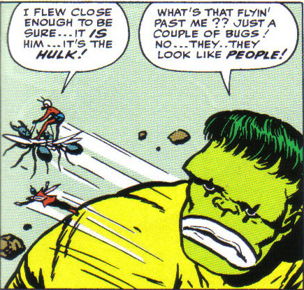
While I'm sure that writer Rich Thomas did his best, the text reads like it had committee fingers all over it. The book is suggested for ages seven and up, but I've seen books aimed at younger readers that had more sophisticated sentences than we find here. The only character who actually demonstrates any real character traits at all is Loki, the villain (and, to a much lesser extent, the Hulk); the rest of the heroes (Thor, Iron Man, Ant-Man, and Wasp) are all interchangeable apart from their powers. The original comic book story from 1963 is hokey and simplistic, sure, but across its twenty-two pages we experience actual characterization along with the action. (Plus, we got the bizarre image of the Hulk hiding out with a circus and wearing clown makeup! Here, he just wears a shroud.)

I get the impression that there was a lot of editorial re-jiggering in putting the book together, as some pieces seem like they're out of order, or just not very well explained. A good example is Bifrost, the rainbow bridge that connects Asgard, the home of the Norse gods like Thor and Loki, to the Earth. The first time the word "Bifrost" is used, it isn't explained at all: "Thor raced over the Bifrost as fast as he could" read the only words on the page, as we see a large image of Thor flying through space. There's a rainbow below and to his side, but unless you already know what "Bifrost" is, you won't have any clue what that word might mean. Especially since this is a book for young readers, you'd expect there to be some context to explain this unfamiliar term when it's introduced. How hard would it have been to add "the rainbow bridge" to that sentence? Six pages later, we read "He found him at the Bifrost, which linked Asgard to other realms." Why wasn't this description, or one like it, used the first time the word was introduced? That's just basic writing gone wrong.

The art, by Pat Olliffe "and Hi-Fi Design" (who, I expect, digitally painted over Olliffe's pencils), is a bit stiff in places, but is also colorful and would probably keep young readers' attention. Some pages contain one large image, while other contain several smaller ones - not exactly laid out as comic book panels, but it's certainly comics-esque. I wonder how many committee meetings there were to determine which characters would appear their 60s costumes (Thor, Hulk, Ant-Man, Loki - even though the story doesn't take place in the 1960s in this version) and who would wear newer ones (Iron Man, Wasp). The Wasp has never worn any one costume for very long, so it's somewhat less of an issue, perhaps, but the choice of the red-and-silver Iron Man costume is odd, as that's not a design that was used for very long in the comics at all, nor has it been used in the films (which is arguably where most people will know the character from these days). It also doesn't match the book on Iron Man in this very series.

Speaking of the Marvel films, I find it odd - but somehow comforting - that this book uses the actual, original Avengers team from the comic book instead of the movie version of the team. However, we do get one double-page spread of various heroes which includes, along with these Avengers, Hawkeye and the Black Widow. No Captain America, oddly enough, but we do also get the Scarlet Witch, Quicksilver, and Hercules.

I appreciate the nostalgia factor in hearkening back to Avengers #1, but if you're going to use that story as a springboard to introduce these characters to a new generation of readers, I think that paying more attention to the characterization that made these characters famous in the first place would be a good idea - as would more careful attention to detail overall.


The Mighty Avengers: An Origin Story
Based on the Marvel comic book series The Mighty Avengers
Adapted by Rich Thomas
Interior Illustrated by Pat Olliffe and Hi-Fi Design
Marvel Press, 2012
ISBN-10: 142314841X
ISBN-13: 978-1423148418
48 pages, $8.99

Friday, January 11, 2013

Review: The Secret of the Stone Frog, by David Nytra

David Nytra (a cartoonist I'd not heard of before) has the honor of creating the first "graphic novel" to be published by TOON Books, those purveyors of fine, hardcover comics for kids, edited by Françoise Mouly. TOON has made a solid choice. The Secret of the Stone Frog is a beautiful, beautiful book, a fantasy adventure starring a sister and brother who find themselves lost in a confusing, magical world. Sound familiar? Of course; it's the stuff of so much great children's literature. And while Nytra clearly knows his fantasy tropes and tellers, his tale is nevertheless fresh and inventive.

Older readers will recognize nods to John Tenniel's illustrations for Alice's Adventures in Wonderland by Lewis Carroll (see especially the large-headed woman who keeps giant bees as pets) and to Winsor McCay's seminal comic strip Little Nemo in Slumberland (see especially the art nouveau-inspired character design and young Alan's Nemo-esque nightshirt) and many other fantasy favorites. Younger readers will lose themselves in exploring every square inch of the book's hyper-detailed black and white pages, from the ornate corner designs to the amazingly detailed landscapes and architecture. (See the sample pages at the TOON Books website for some examples.)

On their travels the siblings also encounter talking, dandified lions; giant rabbits; deep-sea subway riders; a boistrous huckster; and other equally bizarre characters. But the progression from one to the next follows a dream-like logic that takes you safely (if a bit disorientingly) across the book's eighty pages. And while our heroes eventually find their way home, it's as beautiful as any other place we've just encountered on our readerly journey.

If I have one complaint, though, it's that the book uses typeset text instead of more elegant and expressive hand lettering (or even, as I think their other books do, a typeface made to mimic hand lettering). Nytra's word balloons take non-standard shapes, looking at times to have been rendered almost with french curves; to see them filled with serif text is to experience an aesthetic jolt. Emphasized words are printed in a blocky sans serif typeface, further confusing the visual balance of the page. This is of course a small matter that might very well be of no concern to anyone but me, I realize; still, I found it a jarring misstep in what is otherwise a truly lovely overall package.

I definitely look forward to more work by David Nytra, and to more novel-length books from TOON. I've been a fan of their shorter books of comics from the start, and The Secret of the Stone Frog is a worthy addition to -- and expansion of -- their growing library of classics.

The Secret of the Stone Frog
A TOON Graphic Novel by David Nytra
TOON Books, 2012
ISBN-10: 1935179187
ISBN-13: 978-1935179184
80 pages, $14.95

Monday, December 31, 2012

Review: Goliath, by Tom Gauld

Tom Gauld's Goliath retells the biblical tale of "David and Goliath," as originally recounted in 1 Samuel 17, except that this version is told from the giant's point of view. And a very reluctant giant he is; hardly a warrior ("I mainly do admin"), Goliath of Gath is thrust into his position as the Philistines's representative champion though the machinations of a scheming captain. His confusion is palpable, and understandable, but -- being a good soldier -- he does as he's told, finding a sort of peace in his new lot until the inevitable end. As you'd expect from the title, it's Goliath who has our sympathies in this version of the tale: The Giant as Everyman.

Gauld is a crackerjack cartoonist, and his somewhat geometric art style lends a bit of ancientness and grandeur to his telling, even as his dialogue is often mundane and just-this-side-of-sarcastically humorous. His choice to include biblical narration at various points throughout the tale reminds us that this is an old story, yet it also serves as a foil to his own chosen perspective on events, creating ironic high/low tonal distinctions. He also does amazing things with text, such as chopping off word balloons in unexpected fashions to create mood or utilizing a bizarre "typeface" for an Israelite's speech to highlight the fact that Goliath can't understand a word the other man is saying.

The book is a joy to read, but -- because Gauld is such a master of pacing and the use of silent panels -- it also seemed to be over far too quickly. I find myself in the odd position of wishing that this tale were the anchor story in an anthology of other work by Gauld; Goliath is more of an excellently realized "graphic short story" than a "graphic novel." I know that he has another book in the works, a collection of his Guardian strips, and I'm very much looking forward to that. (You can get a preview of those strips in his excellent Tumblr site, You're All Just Jealous of My Jetpack.) I'm also looking forward to seeing him apply his considerable cartooning chops to a really long-form narrative in the future.

Goliath
by Tom Gauld
Drawn and Quarterly, 2012
ISBN-10: 1770460659
ISBN-13: 978-1770460652
96 pages, $19.95