Thursday, February 21, 2013

Review: The Shark King, by R. Kikuo Johnson


R. Kikuo Johnson's The Shark King is another wonderful comic for younger readers from TOON Books. I'm not sure if this tale is an actual myth or just feels like one, to its credit. Set in old Hawaii, the story concerns a woman who falls in love with and marries a mysterious man, and their child Nanaue who, born with special abilities, goes on adventures and meets his destiny. The cape you can see him wearing on the cover helps conceal the boy's strange and somewhat goofy birthright.

Johnson's art style is deceptively simple in its directness - clean and clear, with a muted palette almost out of the 1950s, the drawings often inhabit relatively complex page designs. Readers encounter lots of angular or jumbled panels along with more fairly standard griddings, giving the pages a real life and kinetic energy. (I'm reminded at times of Stephen R. Bissette's page designs in comics such as Swamp Thing and Tyrant - and coming from me, this is high praise indeed.)

The Shark King is what TOON Books calls a "Level Three" book ("Chapter-book comics for advanced beginners [...] Reader needs to make connections and speculate"), and Johnson's work certainly fits this bill. Parts of the tale are told via suggestion rather than statement, encouraging the child reader to ask questions, to guess what has happened or will happen next. This isn't lazy storytelling; it's exactly the opposite. Johnson knows what to emphasize and what to allude to, in order to engage young readers' imaginations. TOON Books expects that kids will be reading these books with their parents, and a story like this will certainly encourage the active engagement of both older and younger readers that can lead to thoughtful reflection and - that grail of grails - re-reading.

I think kids will really enjoy this book, for its artwork, for its imaginative and evocative setting, and for the impish pluck of young Nanaue. Plus, it will give kids yet another reason to tie a towel around their neck like a cape...

The Shark King
by R. Kikuo Johnson
TOON Books, 2012
ISBN-10: 1935179160
ISBN-13: 978-1935179160
40 pages, $12.95

Monday, February 4, 2013

Review: Dotter of Her Father's Eyes, by Mary M. & Bryan Talbot

Dotter of Her Father's Eyes is a book unlike any other I've read, a combined graphic biography (of Lucia Joyce, daughter of James Joyce) and autobiography (of the graphic novel's writer, Mary M. Talbot, daughter of Joyce scholar James S. Atherton and a respected academic in her own right). Talbot had a pretty big "in" in terms of an artist for her first graphic novel, seeing as her husband is the legendary Bryan Talbot, the award-winning creator of many comics and graphic novels, from the groundbreaking The Adventures of Luther Arkwright to heartbreaking The Tale of One Bad Rat to the genre-busting Alice in Sunderland and more.

Given that I've long been a fan of Bryan Talbot's work and studied (and enjoyed!) a fair bit of Joyce in my undergraduate and graduate student days, I was prepared to love this book. Sadly, I only liked it well enough - usually that's fine, but I had such high hopes, given its subject matter and pedigree. Mary is a fine writer, without question, and Bryan's artwork is top-notch as ever (although this is not the bravura performance he gave in Sunderland), but I just didn't feel that these two stories really needed to be told together, or that they benefited much from their joining. It's true that there are obvious linkages between the two (Joyce, most obviously, plus enigmatic fathers), but those links don't really add up to much in the telling, apart from those basic means of comparison.

Lucia's story is heartbreaking, to be sure. A talented dancer, she found her life choices always constrained and compromised by her parents' constant moving from one country to another, even after Lucia reached adulthood. Her eventual committal to a mental institution in 1932 (her first of what became many stays) is as terrible as it is incomprehensible: After one of many rows, Lucia throws a chair at her mother, and "Her brother made a snap decision. He had her committed" (82). We're not given any hint previously that anyone in her family thought she had mental issue: She fights with her parents and chafes at their control, yes, but who doesn't, really? In this telling, this "snap decision" signals the end of Lucia's active life - the book ends less than ten pages later. It's a tragedy, without question, but an incomprehensible one here. Surely there has to be more to the story than a simple "snap decision" by her brother.

Mary's own story, growing up the only daughter in a postwar British household, is engaging, if sad: Eager to please but also intelligent and headstrong, Mary constantly runs afoul of her father and his snap-temper. Perhaps the book's most powerful and damning observation appears on page 30: "Claims about men being unable to express emotion irritate me to no end. My father did anger very well." The love story between Mary and Bryan charms though suggestion; there's enough tensions here to sustain a much longer, more detailed narrative.

Visually, the book is divided into three portions: The present-day frame story, in clearly inked full color panels; Lucia's story, in borderless blue-grey; and Mary's story, borderless and primarily in sepia. The borderless panels throughout both help to emphasize the flashback nature of the narrative and allow for some beautifully blended page layouts. In Mary's story, the artwork is the least polished, with preliminary pencil lines and paste-up markings visible. I'm guessing this is somehow to make that section feel more "authentic," perhaps, as it is the author's own memories? I don't know - it doesn't look incomplete, exactly, but it is rougher... maybe to mirror Mary's own pain at "becoming" an adult?

The pages also show evidence that it was a couple who created the book. There are several places where Mary inserts a footnote about something that Bryan got "wrong" (the frilly apron that her mother never would have worn, the favorite children's book of Bryan's that he "snuck " into a montage of her favorite children's books), and a place or two where we see "dueling footnotes" from both author and artist. It's a cute personal touch, but it creates a bit of tension when it comes to how the book presents history: If there are factual errors (such as they are) in the Mary sections, might the same be true in the Lucia sections? If the book were Mary's (and, to a lesser extent, Bryan's) story alone, these moments would seem utterly good-natured and fun; but they introduce questions of authenticity that seem strange in a book that's based as much on research as it is on memory.

Still and all, I'm glad I read Dotter of Her Father's Eyes. It's an enjoyable if at times painful set of true tales, of interest to readers of biography and history and literature. I imagine that, seeing as how it was awarded the Costa prize for biography, it will serve to introduce non-comics readers to the graphic novel format, which is a good thing, and I'm looking forward to what both Mary and Bryan have coming next.

 Dotter of Her Father's Eyes
by Mary M. Talbot and Bryan Talbot
Dark Horse Books, 2012
ISBN-10: 1595828508
ISBN-13: 978-1595828507
94 pages, $14.99

Sunday, January 27, 2013

Review: After the Fall, by Victoria Roberts

If you're even a casual reader of The New Yorker, you're familiar with the cartoons of Victoria Roberts: They usually feature a prominently-beschnozzed couple quipping about some facet of modern urban life. They're almost the prototypical New Yorker cartoons, except that they skew towards the absurd juuuuuust a bit in a way that no one else's manage to do. I was lucky enough to get to meet Roberts at the Ohio State University Festival of Cartoon Art in 1998, where she was one of the guests. As you might expect, she was as funny and engaging in person as she is in print, and personable, to boot.

So I was excited when I learned that she had recently published an illustrated novel, After the Fall. It's the tale of a quirky Manhattan family (the father's an inventor, the mother's a socialite from Buenos Ares, and the children are precocious) who lose their penthouse and are forced to live in Central Park, cut off from (most of) their creature comforts and needing to survive by wits and charity.

I generally enjoyed the story, although it is very slight. This is a small book, and there are at least one or two illustrations on all but maybe three pages. If you removed the illustrations, the remaining text would make for a fairly short story, so if you're looking forward to luxuriating in a novel's prose, this is not the book for you. While Roberts definitely can turn a phrase with élan, the book's prose is nonetheless somewhat too sketchy for my taste. It reads like something between an urban folktale and a story pitch, with the latter dominating quite a bit. There are great small bits throughout, but I found myself wishing there were more meat on these narrative bones.

The black and white cartoon image are charming and playful, as you'd expect from Roberts' New Yorker work and as the tale demands. While they sometimes act as straightforward illustrations, simply replicating a scene or idea that the text has already described, there are plenty of instances where the images expand on the text in interesting ways. For example, when the narration by Alex (the son) states that "It was more disconcerting than anything else to have our parents get along so well" (82), the facing-page illustration shows Mother and Pops engaged in a game of Twister (with a squirrel holding up the spinner board); the parents are fully clothed (Mother in her turtleneck and slacks, Pops in his bathrobe and matching pajamas), but the pose manages to be simultaneously clearly joyful and also slightly suggestive, making the children's discomfort at their parents' happiness understandable.

Such text/image richness does help to flesh out the story beyond the somewhat bare-bones prose, but it isn't done consistently or dynamically enough to really develop the narrative in ways that justify calling the book a "novel." It's an whimsically entertaining, illustrated short story. Perhaps that is enough.

And, a side note to whoever created After the Fall's Library of Congress Cataloging-in-Publication Data: Just because a book contains cartoon images, that does not make it a "graphic novel." This is yet another example of why I dislike the term "graphic novel": Its over- and misuse as a marketing term has rendered it almost utterly meaningless. After the Fall is no more a graphic novel than are the Diary of a Wimpy Kid books - and those books, at least, sometimes contain brief comics narratives (panel-to-panel storytelling, word balloons). Have we really reached a point where publishers are more comfortable calling an illustrated book for adults a "graphic novel" than they are calling it a "story with pictures"? If so, that is a sorry state of affairs.

After the Fall: A Novel
by Victoria Roberts
W. W. Norton & Company, 2012
ISBN-10: 0393073556
ISBN-13: 978-0393073553
188 pages, $24.95

Sunday, January 20, 2013

Review: Everything Goes: On Land & In the Air, by Brian Biggs

The first work I saw by Brian Biggs was his poetic short graphic novel Frederick & Eloise, published by Fantagraphics in 1993, followed by the lovely Dear Julia, (1995-1997, 2000). Since that time, he's illustrated many delightful children's books written by various authors (I particularly like the Little Golden Book I'm a T. Rex!). I've been lucky enough to get to know Brian a bit, and I was excited when I learned, a couple of years ago, that he had landed a contract for his own series of picturebooks that he would not only draw but also write.

Even after seeing some preliminary sketches and such, though, I wasn't prepared for just how wonderful his series "Everything Goes" would turn out to be. These are large, beautiful looking books, overstuffed with fun, visual details that will keep young children busy, engaged, and entertained for quite some time.

Narratively, the books are extremely simple. In On Land, young Henry and his father take a car trip to the train station to pick up his mother and bring her home. In In the Air, Henry and his parents go to the airport, get on an airplane, and take off. Simple, right? But these books are all about the details - and they feature details in abundance. Along the way in On Land, Henry's father tells the young boy all about the different types of vehicles that the encounter on their car ride: not just automobiles and trucks, but also buses, RVs, motorcycles, bicycles, trains, and more. The presentation alternates between densely packed double-page spreads filled with vehicles and people, with labels and dialogue balloons pointing out various bits of information, and two-page cut-away views of the various vehicle types, showing and naming the various parts (engines, tires, gas tanks, gear shifts, seats - everything you can think of, as well as some things that you wouldn't, like the motorcyclist's "nice socks"). In the Air finds Henry similarly learning all about air travel from his Mom and Dad, from airplanes to helicopters to balloons and more.

But these aren't just dryly informative texts. The dialogue is often funny, especially that of the dozens (hundreds?) of background characters we encounter. Kids can have fun following the mini-stories of some of the characters who appear on multiple pages, like the man whose care battery dies, or the woman who keeps asking about the opposite of what she's doing, or the TSA agent who wonders why there's a single boot on the conveyor belt (hint: that pirate in the metal detector has a wooden leg!). Plus, there are games in each book: Find the numbers from 1-100 scattered throughout the pages! Spot all the birds wearing hats! Discover the things that don't belong! Even I had a blast examining the pages closely, and I'm a bit older than the "ages 4 and up" target audience.

It doesn't hurt - in fact, it helps tremendously - that Biggs' artwork is incredibly appealing. While his earlier comics work featured often delicate, fragile characters in carefully rendered environments, his picturebook style has become bolder, brighter, and perhaps more confident, boasting thick outlines, quirky colors, and slightly bulbous designs. Everything is cute without being "cutesy." But this style still manages to serve the more technical aspects of the books quite well: Even though the various vehicles have been "cartooned" instead of rendered photo-realistically, you still get lots of good information about how things work. There will be a time and place for older kids who need to see every single nut and bolt; but young readers will appreciate - and learn a lot from - Biggs' clear, direct illustrations.

There are also Everything Goes board books (by Brian) and "I Can Read!" books (by another writer and artist "in the style of Brian Biggs") available, too. I haven't had a chance to see any of them yet, but I think it's great that the series is getting a good push from the publisher. I know that children in the library where I work really enjoy spending time with these books, and I bet the kids you know will, too.

Everything Goes: On Land
by Brian Biggs
Balzer + Bray, 2011
ISBN-10: 0061958093
ISBN-13: 978-0061958090
56 pages, $14.99

Everything Goes: In the Air
by Brian Biggs
Balzer + Bray, 2012
ISBN-10: 0061958107
ISBN-13: 978-0061958106
56 pages, $14.99

Thursday, January 17, 2013

Review: The Mighty Avengers - An Origin Story, by Thomas and Olliffe

The Mighty Avengers: An Origin Story is a picturebook re-telling of the story contained in the comic book Avengers #1 (September 1963), by Stan Lee (writer) and Jack Kirby (artist). But even though this book follows that particular comic book very, very closely, you won't see Stan or Jack's names anywhere in the book; instead, on the title page we simply see a credit which reads "Based on the Marvel comic book series The Mighty Avengers." It's corporate boilerplate (Marvel is owned by Disney), which sadly characterizes the book as a whole.

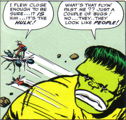
While I'm sure that writer Rich Thomas did his best, the text reads like it had committee fingers all over it. The book is suggested for ages seven and up, but I've seen books aimed at younger readers that had more sophisticated sentences than we find here. The only character who actually demonstrates any real character traits at all is Loki, the villain (and, to a much lesser extent, the Hulk); the rest of the heroes (Thor, Iron Man, Ant-Man, and Wasp) are all interchangeable apart from their powers. The original comic book story from 1963 is hokey and simplistic, sure, but across its twenty-two pages we experience actual characterization along with the action. (Plus, we got the bizarre image of the Hulk hiding out with a circus and wearing clown makeup! Here, he just wears a shroud.)

I get the impression that there was a lot of editorial re-jiggering in putting the book together, as some pieces seem like they're out of order, or just not very well explained. A good example is Bifrost, the rainbow bridge that connects Asgard, the home of the Norse gods like Thor and Loki, to the Earth. The first time the word "Bifrost" is used, it isn't explained at all: "Thor raced over the Bifrost as fast as he could" read the only words on the page, as we see a large image of Thor flying through space. There's a rainbow below and to his side, but unless you already know what "Bifrost" is, you won't have any clue what that word might mean. Especially since this is a book for young readers, you'd expect there to be some context to explain this unfamiliar term when it's introduced. How hard would it have been to add "the rainbow bridge" to that sentence? Six pages later, we read "He found him at the Bifrost, which linked Asgard to other realms." Why wasn't this description, or one like it, used the first time the word was introduced? That's just basic writing gone wrong.

The art, by Pat Olliffe "and Hi-Fi Design" (who, I expect, digitally painted over Olliffe's pencils), is a bit stiff in places, but is also colorful and would probably keep young readers' attention. Some pages contain one large image, while other contain several smaller ones - not exactly laid out as comic book panels, but it's certainly comics-esque. I wonder how many committee meetings there were to determine which characters would appear their 60s costumes (Thor, Hulk, Ant-Man, Loki - even though the story doesn't take place in the 1960s in this version) and who would wear newer ones (Iron Man, Wasp). The Wasp has never worn any one costume for very long, so it's somewhat less of an issue, perhaps, but the choice of the red-and-silver Iron Man costume is odd, as that's not a design that was used for very long in the comics at all, nor has it been used in the films (which is arguably where most people will know the character from these days). It also doesn't match the book on Iron Man in this very series.

Speaking of the Marvel films, I find it odd - but somehow comforting - that this book uses the actual, original Avengers team from the comic book instead of the movie version of the team. However, we do get one double-page spread of various heroes which includes, along with these Avengers, Hawkeye and the Black Widow. No Captain America, oddly enough, but we do also get the Scarlet Witch, Quicksilver, and Hercules.

I appreciate the nostalgia factor in hearkening back to Avengers #1, but if you're going to use that story as a springboard to introduce these characters to a new generation of readers, I think that paying more attention to the characterization that made these characters famous in the first place would be a good idea - as would more careful attention to detail overall.


The Mighty Avengers: An Origin Story
Based on the Marvel comic book series The Mighty Avengers
Adapted by Rich Thomas
Interior Illustrated by Pat Olliffe and Hi-Fi Design
Marvel Press, 2012
ISBN-10: 142314841X
ISBN-13: 978-1423148418
48 pages, $8.99

Friday, January 11, 2013

Review: The Secret of the Stone Frog, by David Nytra

David Nytra (a cartoonist I'd not heard of before) has the honor of creating the first "graphic novel" to be published by TOON Books, those purveyors of fine, hardcover comics for kids, edited by Françoise Mouly. TOON has made a solid choice. The Secret of the Stone Frog is a beautiful, beautiful book, a fantasy adventure starring a sister and brother who find themselves lost in a confusing, magical world. Sound familiar? Of course; it's the stuff of so much great children's literature. And while Nytra clearly knows his fantasy tropes and tellers, his tale is nevertheless fresh and inventive.

Older readers will recognize nods to John Tenniel's illustrations for Alice's Adventures in Wonderland by Lewis Carroll (see especially the large-headed woman who keeps giant bees as pets) and to Winsor McCay's seminal comic strip Little Nemo in Slumberland (see especially the art nouveau-inspired character design and young Alan's Nemo-esque nightshirt) and many other fantasy favorites. Younger readers will lose themselves in exploring every square inch of the book's hyper-detailed black and white pages, from the ornate corner designs to the amazingly detailed landscapes and architecture. (See the sample pages at the TOON Books website for some examples.)

On their travels the siblings also encounter talking, dandified lions; giant rabbits; deep-sea subway riders; a boistrous huckster; and other equally bizarre characters. But the progression from one to the next follows a dream-like logic that takes you safely (if a bit disorientingly) across the book's eighty pages. And while our heroes eventually find their way home, it's as beautiful as any other place we've just encountered on our readerly journey.

If I have one complaint, though, it's that the book uses typeset text instead of more elegant and expressive hand lettering (or even, as I think their other books do, a typeface made to mimic hand lettering). Nytra's word balloons take non-standard shapes, looking at times to have been rendered almost with french curves; to see them filled with serif text is to experience an aesthetic jolt. Emphasized words are printed in a blocky sans serif typeface, further confusing the visual balance of the page. This is of course a small matter that might very well be of no concern to anyone but me, I realize; still, I found it a jarring misstep in what is otherwise a truly lovely overall package.

I definitely look forward to more work by David Nytra, and to more novel-length books from TOON. I've been a fan of their shorter books of comics from the start, and The Secret of the Stone Frog is a worthy addition to -- and expansion of -- their growing library of classics.

The Secret of the Stone Frog
A TOON Graphic Novel by David Nytra
TOON Books, 2012
ISBN-10: 1935179187
ISBN-13: 978-1935179184
80 pages, $14.95

Thursday, January 3, 2013

Review: Elephant House: Or, the Home of Edward Gorey, by Kevin McDermott

An exquisite gem of a book, beautifully photographed and peppered with anecdotes and factoids of a life artfully lived.

Elephant House: Or, the Home of Edward Gorey
Photographs and text by Kevin McDermott;
Introduction by John Updike
Pomegranate, 2003
ISBN-10: 0764924958
ISBN-13: 978-0764924958
128 pages, $35.00


This review was originally published at Goodreads.